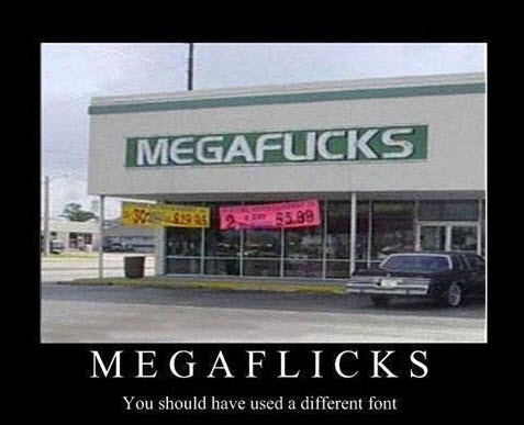
Fancy fonts can actually hurt your website. Keep fonts simple and your website is more appealing and easier to read.
And in some cases, a bad fonts choice can distort your message and maybe even scare customers away. Consider this font fail.
YIKES! Needless to say, this store owner made a bad font choice. Imagine the customers that took a quick glimpse at “Megaflicks” and walked away before taking a closer look. In this case, a cleaner font would clear-up the message and help get more customers. Well, at least a better font would not scare people away!
The lure of “cutesy” fonts on a website falls in the same category as Flash intros and over-the-top animation. While these design elements may seem like a good idea in theory, they distract from your website and dilute your message.
On the Web content is king. And while a nice looking website is like catchy art on a book cover (in that it may get your attention), it’s the words on the pages that keeps you coming back for more. The same is true for your website.
Consider the following study…
Two groups of people were given a set of instructions. One group received directions in a simple Arial font, and the other group received directions in a fancy, or harder to read Brush font.
 The people who received the simple font estimated it would take 8.2 minutes to complete the directions whereas the people who received the complex font estimated that it would take 15.1 minutes to complete.
A simple font change, and people estimated that directions would take around 86 percent longer.
What’s that mean to you?
Given that web surfers are very A.D.D., a distracting font means users are less likely to even start reading your content. And just like those people who misread “Megaflicks” and kept walking, you can loose potential customer before they even read the first word on your website.
Think of what you want when you are surfing the web. Often fancy intros and busy websites can be distracting when what you really want is information.
Font Advice
- For content, stick to the basic fonts: Arial or Times Roman
If you look around at other major website, these are the fonts you will see (at least for content) - It’s important to create contrast between your font color and background.
Studies have shown that on the Web dark fonts on a light background are easier to read. - Don’t go crazy with different font colors as it could make your website look cheesy.
Use the same color font with bolder font weight for emphasis. - Refrain from using more than 2 different font types on your site. It becomes confusing and your design goes from distinguished to disgusting.
- You can use fancy fonts on logos or titles, but be consistent and practical when selecting your logo font.
Don’t let the fonts on your website be a megaf#%*!

[…] Click here for more info and a study on the negative impact of fonts that are too fancy. […]